The year 2026 marks a significant shift in how we perceive our living environments, moving away from sterile minimalism toward emotional resonance. Homeowners are increasingly seeking palettes that reflect a balance between technological advancement and a deep-seated need for nature. This evolution is driving a new wave of interior design that prioritizes sensory comfort and personal expression above all else.
The Rise of Digital Pastels and Tech-Organic Hues
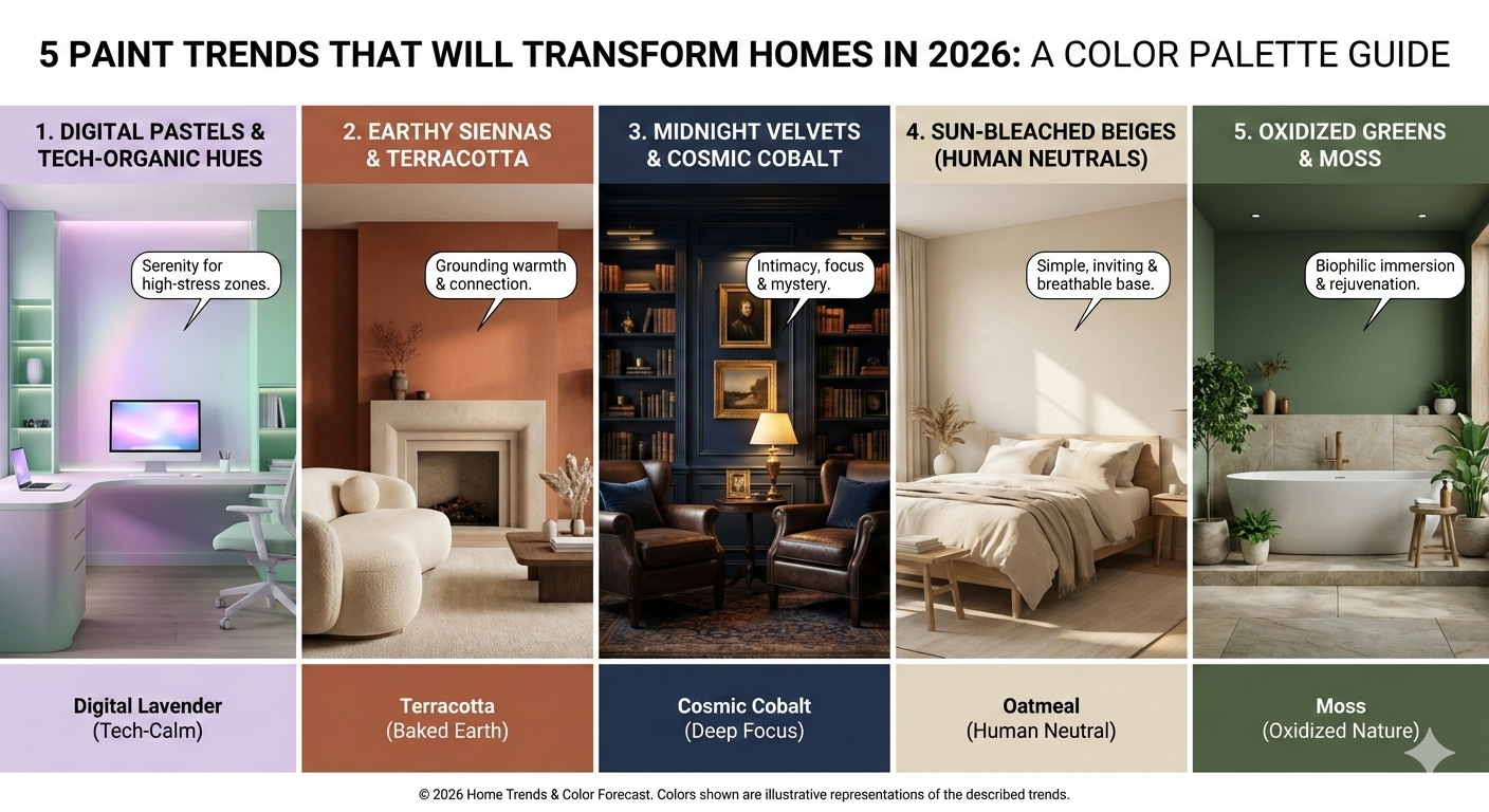
As our lives become more integrated with digital interfaces, the trend color for home palettes is reflecting a unique fusion of the virtual and the physical. We are seeing a surge in colors that feel slightly “augmented,” such as hyper-saturated lavenders and glowing mint greens. These shades do not just sit on a wall but seem to interact with the ambient light of the room in a way that feels futuristic yet surprisingly cozy.
Digital Lavender and the New Calm
Digital Lavender has evolved from a fashion statement into a cornerstone of interior design for 2026 because of its inherent stability. It provides a sense of serenity that is essential for high-stress environments like home offices or creative studios. When applied to large surfaces, this color works to reduce visual noise and creates a meditative backdrop for modern furniture. Designers are pairing this shade with metallic accents to emphasize its sleek, contemporary origin.
Grounding the Interior with Earthy Siennas and Terracotta
While digital tones look forward, there is a simultaneous movement toward the primal and the permanent. The trend color for home selection for many leading architects in 2026 focuses on “The Grounding,” which utilizes deep reds, burnt oranges, and clay-like siennas. These colors provide a psychological anchor in an increasingly fast-paced world, offering a sense of history and artisan craft.
The Tactile Warmth of Baked Earth
Terracotta is no longer reserved for pottery or Mediterranean flooring as it moves aggressively onto the walls of living rooms and dining areas. These pigments contain a natural warmth that mimics the glow of a setting sun, making spaces feel inherently more social and welcoming. By using matte finishes, homeowners can achieve a velvety texture that looks different at every hour of the day. This trend is particularly effective in northern-facing rooms that lack natural warmth and require a color-based energy boost.
Embracing the Depth of Midnight Velvets and Cosmic Cobalt
The era of the “all-white” room is officially over as we move into 2026, replaced by a desire for intimacy and mystery. Dark, moody tones are becoming the preferred trend color for home libraries and primary bedrooms where depth is prioritized over brightness. These colors act as a canvas for high-contrast decor, allowing gold frames, vibrant art, and light-colored textiles to pop with dramatic intensity.
The Intellectual Power of Cosmic Cobalt
Cobalt blue has transitioned into a more sophisticated “Cosmic” variant that leans into the darker side of the spectrum without losing its vibrancy. It is a color that suggests intelligence and focus, making it a brilliant choice for areas dedicated to study or deep thought. Unlike lighter blues, this shade creates a “cocoon” effect that helps the inhabitant feel secure and enclosed. Experts suggest using this color in rooms with high ceilings to prevent the space from feeling too cramped while maintaining its regal presence.
The Evolution of Neutrals into Sun-Bleached Beiges
Gray is being phased out in 2026 in favor of what designers call “Human Neutrals,” which are shades that contain warm undertones like pink, yellow, and peach. These colors are designed to flatter human skin tones and make the home environment feel more alive and less like a showroom. The shift toward sun-bleached neutrals reflects a global desire for simplicity and a “slow living” lifestyle that values quality over quantity.
Moving Beyond the Cold Minimalism of the Past
The new neutrals, such as oatmeal and bone, offer a much softer transition between rooms than the stark whites of previous decades. These colors respond beautifully to natural textures like linen, wool, and light-toned woods, creating a cohesive and breathable atmosphere. By choosing a trend color for home that leans warm, you ensure that the space remains inviting even during the colder months. This palette serves as the perfect foundation for those who like to change their accessories seasonally without repainting.
Biophilic Immersion Through Oxidized Greens and Moss
Biophilic design continues to dominate the industry, but in 2026, the greens are becoming more complex and “oxidized.” Instead of the bright jungle greens of the past, we are seeing a move toward sage, olive, and deep forest hues that feel established and ancient. These colors are meant to blur the line between the garden and the interior, fostering a continuous connection with the botanical world.
Creating a Spa-Like Sanctuary with Moss Tones
Mossy greens are particularly popular in bathrooms and wet rooms because they evoke the feeling of a natural spring or a forest floor. This trend color for home wellness areas helps to lower the heart rate and promote a feeling of rejuvenation and physical health. When combined with natural stone and moisture-loving plants, these green walls transform a standard bathroom into a high-end retreat. It is a color choice that rewards those who want their home to be a literal breath of fresh air.
The Psychological Impact of Color Selection in 2026
Choosing a paint color is no longer just an aesthetic decision but a strategic move for mental well-being and productivity. The data from 2025 consumer surveys indicated that people living in color-rich environments reported higher levels of daily satisfaction than those in monochromatic homes. As we enter 2026, the trend color for home choices are being driven by a desire to curate specific “mood zones” within the household. This allows a single home to serve as a workplace, a gym, and a sanctuary simultaneously through clever color zoning.
Designing for Longevity and Emotional Resonance
The trends we see today are moving away from “fast fashion” interiors toward colors that homeowners can live with for a decade. High-quality pigments with complex undertones are being favored because they change beautifully as the seasons pass. By investing in these deeper, more thoughtful palettes, you are creating a home that ages gracefully alongside its inhabitants. This shift represents a more sustainable approach to interior design where the focus is on timelessness rather than temporary hype.


